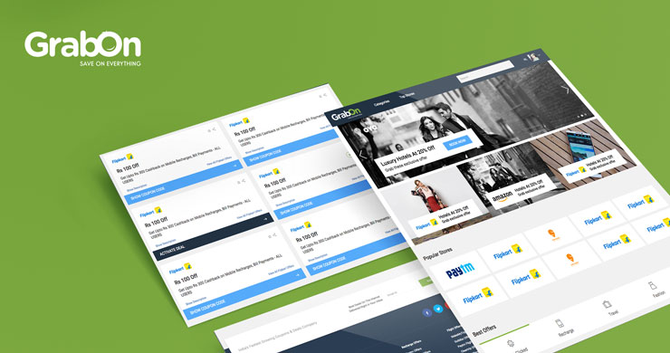
GrabOn started in 2013 with the idea of making online shopping easy and affordable. Many challenges were thrown and they were overcome. 3 years later GrabOn brags a market share of 18% in the couponing and deals sector.
Changes are good: All New, All Improved GrabOn Website
Given the technology pipeline in works, in the coming months, we plan to scale to a market share of 25%. All of this is made possible due to the technological advancements team GrabOn strives for. Keeping up with the tradition of continuous progress and innovation, we have launched a new website on the occasion of our 3rd anniversary.
The all new, all improved GrabOn website is neat, simple and more user-friendly.
Let’s have a look at some of the key changes:
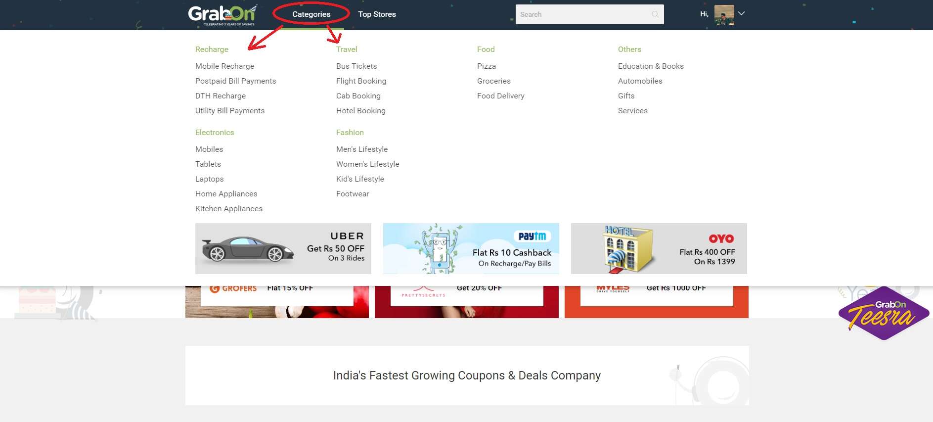
#1 Drop-down menu in the navigation bar
The new drop-down menu in the navigation bar is now accessible just by hovering over it. No click, no tap, the categories are just a hover away!
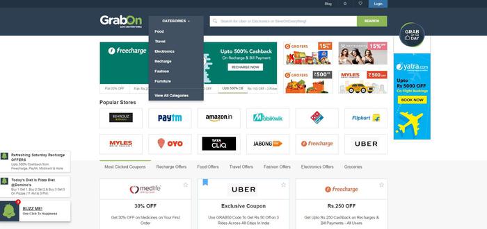
In the previous version, the drop down menu in categories would be accessible only by clicking on it.
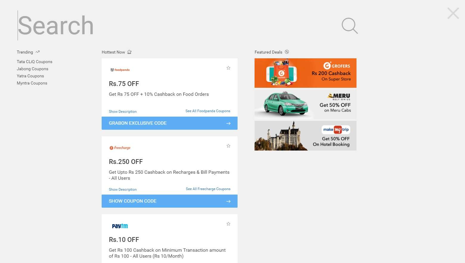
#2 Search box-major modifications
First, of it’s kind in the couponing industry, the new and improved search box provides you with an immersive search experience. It shows you trending coupons, hottest offers across all categories and featured deals by expanding upon a single click!
The search box in the earlier version was a regular one wherein you punch in keywords and it shows you the appropriate store, coupons or deals.

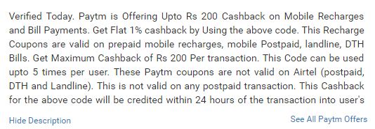
#3 More accessible description button design in the coupons code section
The coupon description section has been redesigned keeping in mind the user’s comfort. The description opens up by a single click on ‘show description’.

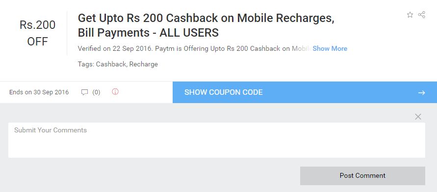
#4 Introduction of ‘Comment Addition’ feature in the coupons
The addition of the comment feature enables you to provide your valuable input and feedback on coupons.
#5 Overall minimalistic, cleaner and user-friendly design
The new website design is neat, simple, clean and minimalistic. It makes browsing for coupons, fun and easy.
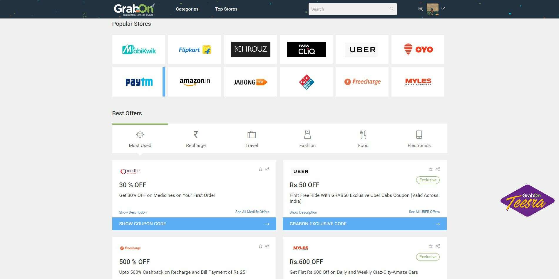
Apart from all these major changes, there are many other small customizations that make your overall browsing experience a smooth and pleasant one.
Now, meet the team that made it all possible. Our very own hardworking family of GrabOners who put in their effort day in and day out to make your online shopping affordable, coupon hunt comfortable and browsing go easy on your eyes! How, you ask?
Well, we believe in the good old-fashioned hard work.

We also indulge in the occasional table tennis banter, because all work and no play makes Jack a dull boy!

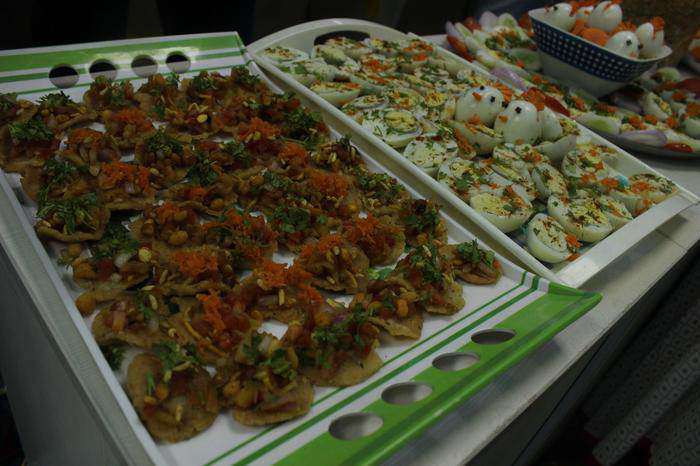
Did I tell you, we’re a bunch of foodies? Yeah, so potlucks are a plenty!
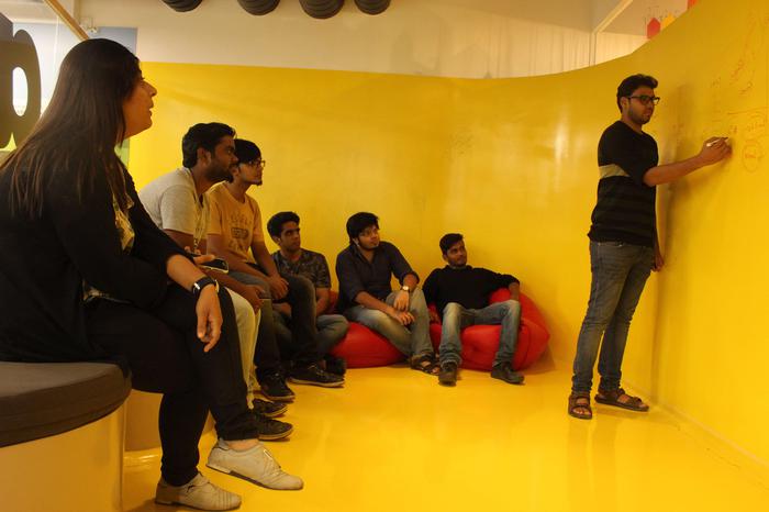
Learning is a very important part of GrabOn. We learn we develop, we grow and we make your couponing experience memorable.
We are a patriotic lot and don’t hold back from unfurling the tri-color any chance we get.

Above all, we never stop improving, innovating and making 100% sure that your coupon hunt is worth it.

So, what did you think about our new website, didn’t try it yet? Well here you go, do try and let us know. Your feedback and suggestions are valuable to us.
Happy couponing to you!
